Wednesday, September 30, 2009

Selective Twitter Status for Fan Pages and Personal Profiles


Saving time by having all of your tweets update to your Facebook status might sound fabulous, but sometimes your tweets make no sense out of context. Here's an example of a reply I made that would not belong on Facebook: @macaroniandglue I like the part-how many redshirts did they lose-can't be many left.
If you made more than, let's say two tweets a day like this, it would quickly become annoying to Facebook friends/fans and even more so for those who were not on Twitter.
Thanks to a Facebook application by Andy Young, called Selective Twitter Status, you are allowed to selective
ly update your Facebook status from Twitter. You choose which tweets to allow by ending your post with #fb.
Here's how to set it up.

1) Log in to Facebook, enter "Selective Twitter Status" into the search box on the top right and click on the search icon.


2) When you get to the page, click on "Go to application"


3) Enter your Twitter user name and click "Save"
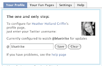


4) Now, simply add #fb when you want to update your Facebook status.

Note:

1) If you're currently using the Twitter application or other app to update your status, remember to remove or disable it so that it doesn't keep updating with all your tweets.
2) In your Twitter "settings", make sure "Protect my Tweets" box is unchecked.

Wednesday, September 16, 2009

Do Your Consumers Know Your Brand?


Your brand is what your consumers and employees think of your services and company. Brand makes an emotional connection to them about your company. Being remembered is essential and a companys brand, or recognition is considered one of the most valuable company assets.

You may be hearing, bzzzzzzzzzzzzzzzz.

Really, design is like a conductor of an orchestra for your audience. Like music, design has an intangible quality like this:

The silence is pure energy as the audience awaits the beautiful flow of sound and emotion. It begins with one instrument, the core of the piece, the flautist. As the invisible power is built up with more instruments, your heart flutters with the passion of the music passing through you. The speed of the first movement keeps increasing and has the precision of a sailboat cutting through the water. It ends leaving everyone’s breath taken away, wanting more.

Did you hear that? That’s the invisible power that coordinates thousands of decisions and shapes behavior of a well thought out idea. Image by Anti-Ink conveys this idea perfectly.

Tuesday, March 10, 2009

Ecofont


Here is a creative idea in increasing environmental awareness. Ecofont was developed by Spranq and uses 20% less ink. It is meant to be used in regular sized reading material.
The company co-founder Gerjon Zomer concedes that the font isn't beautiful, but it could be adequate for personal use or for internal use at a company.
Beauty is in the eye of the beholder. I think a perception can be changed knowing the end result is fewer used ink cartridges and toner. What do you think? Download it for free, here.

Wednesday, February 25, 2009

Adore this identity!


I'm showing this Adore identity paired with my calendar design to show how my corporate work and personal work influence each other. The identity came first. I was so inspired and had so much fun that I took the design aesthetics and created an illustration style applying it to animals and plant life.
I'll tell you a little bit about how Adore came about: Tammy came to Blue Tricycle wanting a name, tagline, logo and identity system for her company. She wanted to reflect her personality and the kind of clients she worked with. Tammy also had an image board of sorts-a folder full of textures, illustrations, photos and objects. {Adore works with small companies and advertising agencies creating strategic development and project management services.}

Wednesday, February 18, 2009

Top Ten Colors for Spring


Pantone released its Top Ten Colors for Spring following Fashion Week. "New York fashion designers encourage hopeful attitudes with lively colors, while sophisticated, grounded hues address the need for stability in times of eonomic uncertainty," says Pantone Color Institute.
"Why do two colors, put one next to the other, sing?" Pablo Picasso
Where do you get your color inspiration?

Tuesday, February 17, 2009

The RikRak Studio Giveaway


Everything about rikrak screams FUN! Check out this giveaway-
a superdooper rikrak thank you pack- it includes:
...................................................................................................
  • one vintage fabric clutch purse(made in the fabric of your choice!)
  • plus one vintage fabric wallet / business card holder/ gadget home (made in the fabric of your choice!)
  • plus one set of 3 fun blue vintage floral fabric magnets
  • plus 2 iron-on fabric birdies (made in the fabric of your choice!)
  • plus 1 pretty vintage dark turquiose blue fabric eco.brooch
  • plus a few more little rikrak goodies, too!
...................................................................................................

this fun giveaway prize pack is valued at over $65.00 US and it can be yours, for FREE!

here's how you can win!

Thursday, February 12, 2009

Clever Use of Scrapbook Papers


I was pleasantly surprised to find these scrapbook papers on my 10 year olds walls. I love that you can hand over something to a child and they will find an extraordinary use for it. Plus, it buys us time on painting her walls!
She also helped organize her 5 year old sister's room by setting up a "tray" for her tea set. Cute!